Work
Six engagements, and what actually changed.
Each of these ran eight to twelve weeks and ended with somebody else able to keep it going. Some of the work we like best is not here, because the client has not launched it yet. Ask about that.
Six we can talk about
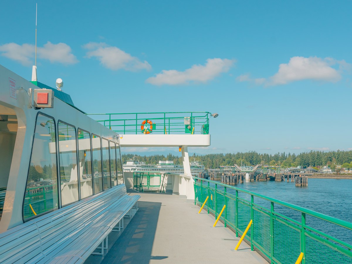 Coastal transport
Saltbox Ferry Co.
A family ferry line between two islands, running the same crossing for three generations and selling it as a fare between two parking lots.
We kept the name. Everything else was rebuilt around the forty minutes in the middle: the crossing is the reason people come, and nothing the company had ever published said so. New schedule boards, new ticket copy, new signs at both docks.
The summer sailings sold out earlier than the year before, and the deckhands stopped being asked how long it takes.
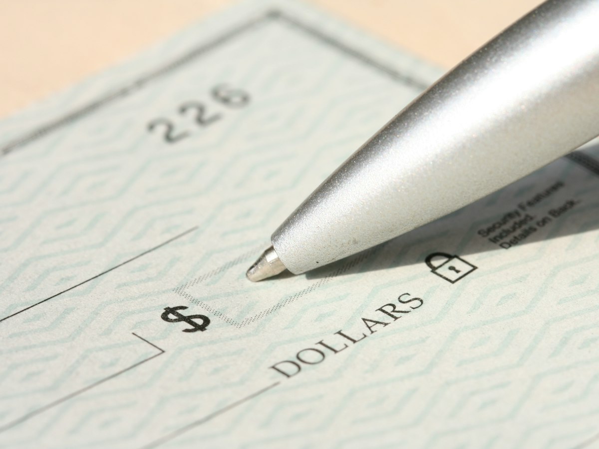 Community banking
Millrace Credit Union
A community bank whose letters read like a court summons and whose rate sheets read like a different company altogether.
The position was already true and nobody had written it down: this is where the money of people who live within four miles of the branch is kept. We wrote it that way, then rewrote the loan letters, the branch signs and the script on the hold line to match.
Membership applications rose for three straight quarters. Nobody mentioned the logo, which we had barely touched.
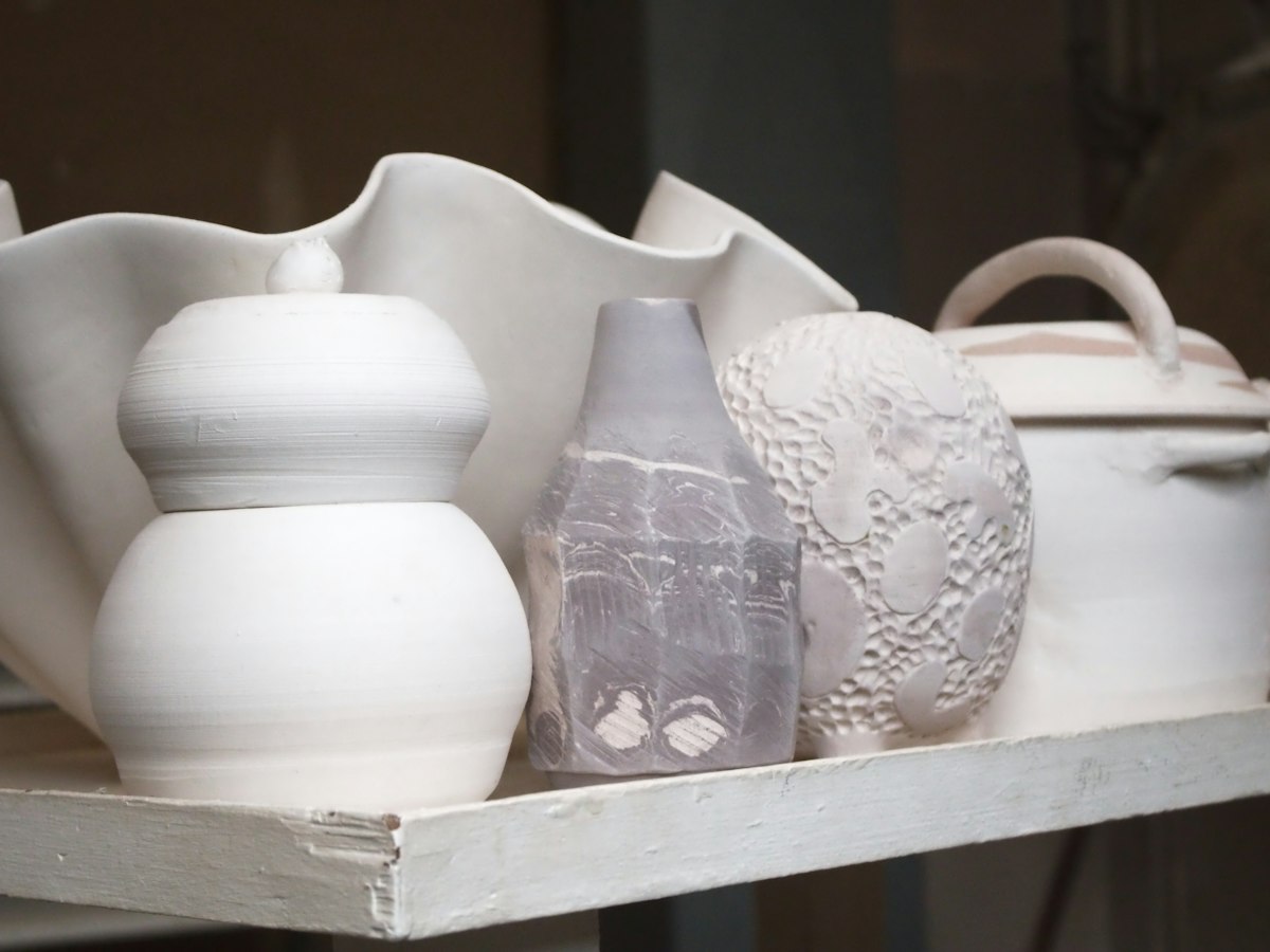 Ceramics
Kiln & Tide
A two-person ceramics studio moving from a market stall to wholesale, where the maker is no longer standing beside the pot to explain it.
We worked out what the stall had been doing for them and built it into things that travel: a mark that reads at thumbnail size, a box, a line sheet, and four sentences a shop owner can repeat to a customer.
Their first wholesale order was larger than their best six market days put together.
 Retail
Barrowfield Hardware
Eleven hardware stores that had been eleven separate stores for thirty years, each with its own sign painter and its own idea of what the company was called.
The one thing all eleven shared was staff who know where everything is, which is the entire reason anybody drives past a big box to get there. We named that, built a sign system around it, and kept each store's local name underneath the new one.
The eleventh store stopped being treated as the odd one out.
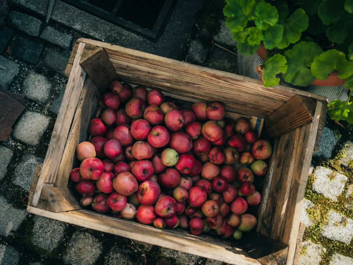 Food and drink
Crookhorn Cider
A regional cider maker with four good products and labels that made all four look like the same gift-shop candle.
We cut the range to three, wrote what each one is actually for, and gave the bottles a hierarchy a distributor can shelve without asking. The tasting-room copy came last and took twice as long as the labels, because that is where somebody decides whether they like you.
Two chains that had passed on it the year before picked it up.
 Public sector
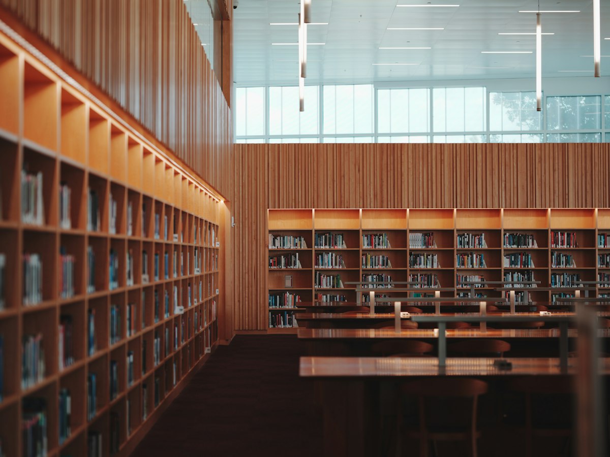
Winnow County Library System
Fourteen branches, a logo from 1994, and a public that thought the library was mostly books.
We named the thing people actually use it for: a warm room with a printer, a card that works like a season ticket, and somebody at a desk who will answer a question nobody else will. Then we rebuilt the signs, the card and the seasonal campaign around that.
Card sign-ups in the first quarter after the launch were the highest the system had on record.
Want the parts that went wrong?
We will walk an engagement end to end, including the week a direction got thrown out and what it cost to find that out late.